
By Rich Harris
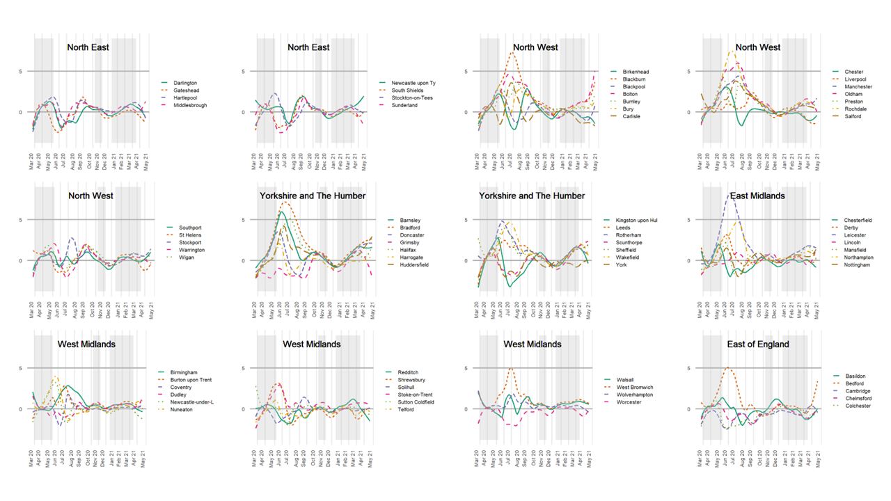
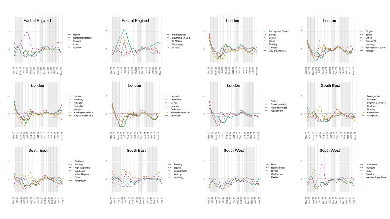
It will be unsurprising to anyone who has followed the COVID-19 pandemic in England that there is geography to the disease, for a while reflected in the ‘tier system’ and in certain towns and cities entering in and out of local lockdowns. Relative peaks and troughs are indicated in the charts, below, which cover the period from the seven days ending March 21, 2020, to the seven ending ending 15 May 2021.
This geography of COVID-19 is both a cause and a consequence of other geographies – including those that are socio-economic, demographic and ethno-cultural. Take, for example, the higher infection and death rates amongst people of colour and, especially, black groups at the outset of the pandemic. This, in part, reflects higher occupational and environmental risks amongst those groups, of the sort that led Channel 4 to be asking ‘Is Covid racist?’. However, it also reflects the ethnic diversity of London, which is a densely occupied and globally connected city where the virus emerged most clearly, soonest, within the UK. It is, in part ‘a London effect’ but not fully, because even within London, a greater number of deaths was associated with Asian and Black ethnic groups, socio-economic disadvantage, very large households (likely indicative of residential overcrowding), and fewer from younger age groups – see Harris, 2020.
So, what happens if we ‘control’ for the geography and measure the contextual risk of various groups to infection and to death, relative to the town and city in which they reside? The answer is suggested in Figures 2 and 3, which show a measure of average exposure per group, before and after controlling for the geographical trends.

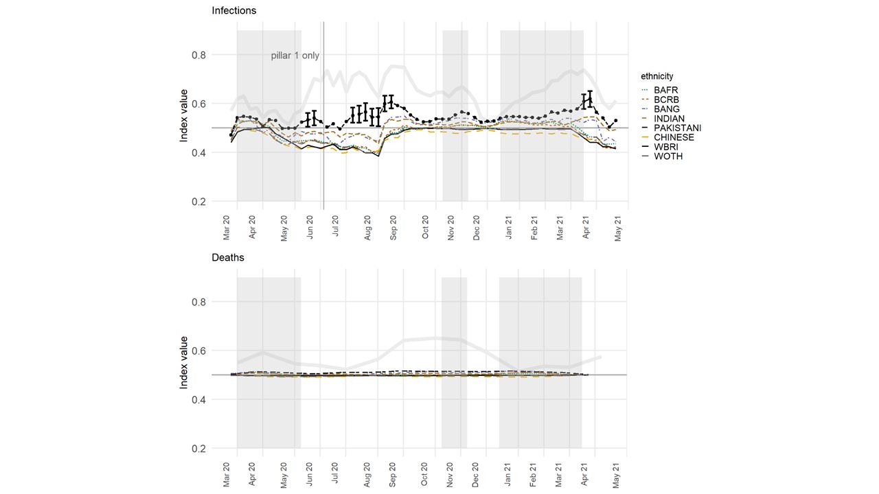
Unsurprisingly, taking away the geographical component ‘flattens the curve’, especially for exposure to death in neighbourhoods; although, for infections, differences between the ethnic groups remain clear. This finding should not be understated because even under a restricted scenario that focuses only on urban areas, which removes the broader-scale patterns in the disease and allows for uncertainty in the index scores, still the Pakistani group is found to have been exposed disproportionately to the higher COVID-infected neighbourhoods than are other groups. Meanwhile, the Chinese and the White British are often the least exposed groups, at the local level.
A partial explanation for the health inequalities is housing inequalities. These, as well as occupational exposure, are linked to other sub-national, socio-economic inequalities including the imbalanced nature of regional economies and employment structures in the UK.
Writing in The Guardian, Danny Dorling picks up these themes, arguing that the key to understanding the geography of COVID-19, “is the underlying social and economic geography of England. To understand the changing medical geography of this pandemic, you must first understand how the country lives and works.”
And to tackle the health inequalities that the pandemic has made obvious, you must also tackle residential and employment inequalities too.
Further reading:
Harris, R., Brunsdon, C. Measuring the exposure of Black, Asian and other ethnic groups to COVID-infected neighbourhoods in English towns and cities. Appl. Spatial Analysis (2021). https://doi.org/10.1007/s12061-021-09400-8